Thursday, 26 February 2015

Theatrical Miss Haversham Experiments

To help me decide what look I wanted to do for Miss Haversham I decided to try out a theatrical makeup look as well as a TV more subtle ageing look. Today was all about experimenting with the tips we learnt in Sue's ageing lesson. I found it really helpful to follow the natural creases of my own face to create these lines and wrinkles. 

Products Used:
Skin Base, Illamasqua
Charles Fox supracolour, purple, red, white, black
Charles Fox Concelar palette

Firsty I primed my skin as well as using skin base from Illamasqua. 


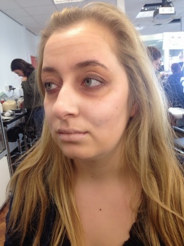
Then I started following my creases exaggerating these of course! I added crows feet, frown lines, forehead lines, smile lines, creases on my nose and lips and dark under eyes. 


I added a redish browny shade onto the under eyes to make them look really dark and sunken. 
I really loved the effect of this concelar underneath the eyes. I smudged it in with my fingertips to warm the product.
I decided to use my supra colour to add a tear drop onto the cheek to add a little more of a Miss Haversham feel to the look!

Next time I want to experiment with a more subtle ageing for a younger Miss Haversham. 

Early, Mid and Late Victorian Hairstyles

From my research I've found out a lot so far on Victorian hairstyles. Through the era women changed the fashion of hair quite drastically. In the early Victorians women were seen in portraiture to be wearing very sleek hair styles. From image research I've noticed many centre partings. Decoration was an important part of dressing the hair for Victorian women. I found texture in the portraits at the top of the hair flowing in an almost 'finger wave' motion at the top of the hair. Women wore tightly formulated buns on the top to the mid section of their scalp. Often these had plates within the buns or some kind of decorative flower or laced effect. The bun almost has a circular motion with hair going around the bun in a very sleek way. A lot of portraiture has women wearing a symmetrical style with curls facing inwards to the face with a straight part at the top, this would only be the very front section of the hair which seemed a little shorter to the back as women had very long hair as they never believed in cutting it. The condition of the front of the hair may have been shorter due to it maybe snapping off.

I've researched a few portraits of women at the time from the start of the Victorian era further to late Victorian times. Here is my idea of an early Victorian style. (This image has an unknown date. http://www.beauty-and-the-bath.com/beautiful-victorian-hairstyles.html)
The women has curls facing inwards to her face with a centre parting. The back of the hair is in a structured bun with decoration throughout the hair and crown of the head. She does have a little hair flowing down at the back of the head but usually women did not cut their hair so the women may've had extremely long hair to all fit into a tight bun which was fashionable.


Here I've practiced my own version of an inward curl ringlet. I used curling tongs to face the curl inward to get this effect.


The opposite side of the hair went well and I'm pleased with how it turned out. It looks like an early Victorian style. 


At the back of the head I wanted to make sure the whole hair was going to be put up. At the time buns were quite simplistic so I just wrapped the hair around and pinned it in place to create this bun.


Next; for a mid Victorian hairstyle I wanted to create the look which hair is centre parted and then wrapped around the ear. This look was inspired by this image which has a slowly progressing lower bun. The hair looks a lot more relaxed and not so done up. It's a little more casual but still very sleek like the early Victorian styles. 
I added a little twist on my recreation using a simple plat each side of the head which was brought slightly more forward to get the swooping effect around the ears on the sides. 


Lastly the next part was to look into 'late Victorian' hair. I found the styles to be a lot more relaxed, romantic and looser. Curls were still a big part of doing the hair but hair tended to be worn down more often. Some of the curls in the image below look as if they're facing outwards from the face too which is different to the early hair styles. 


Another hair image I really liked which had the hair done up in a loose brought forward to the face style. This style seems to still be similar to current trends in our century which is quite interesting. 

I decided to take on board the styles of late Victorian hair from my research and incourporate these into my designs for practicing late Victorian hair. Because the styles are a lot looser and more romantic curl looks it's very important you must curl the entire hair before styling to give the hair more body and shape to give the final outcome.i tried to make the final style to have curls running downwards towards the back and the hair at the sides to be in a middle parting and for the mid section to be loosely up ontop of the crown.


The front of the hair was styled by curling inwards so it gave a wave on top of the parting.


Late Victorian hair is definitely on of my favourite styles to recreate and I look forward to practicing and perfecting these styles. The hair from the time reminds me of bridal hair too the way it's so flowing and pretty, which reminds me of Miss Haversham from Great Expectations original style from her wedding. 

Theatrical Ageing

Theatrical Ageing


For the theatre you need to make sure makeup is much more elaborate so that the whole audience can have the same image of the character. Ageing is used in ways such as: adding lines, wrinkles, age spots, flushed cheeks and missing teeth and this can all be done by the use of cosmetics. This is the opposite to beauty makeup, in this case we want to pull out all bad features including making dark circles, lines and creases and adding crows feet around the eyes.

Products needed:
Primer
Moisturiser
Supra colour kryolan pallette 
Palette knife to depot products
Foundation in models skin tone
Disposable mascara wands
Tooth dye (kryloan) 


Step by step theatrical ageing process:


Cleanse, tone and moisturise the skin to prep it for the theatrical makeup.

Optionally add a base to the skin foundation and concealer. 

Add moisturiser into a palette and mix together with kryolan supra colour greasepaint with a brown/green/dark red and a tiny bit of black to add the lines, only add a moisturiser to your colour if it's a grease based product. This is to make lines and wrinkles. 

Firstly go around all creases of the face; smile lines, frown lines, around the nose, on the edges of the nose to thin it out, thin the lips, screw up the eyes and make crows feet. This can be done quite dramatically as it's for the theatre. To draw on with a thin small brush.

Now to make bushy eyebrows mix together yellow and white supra colour to get a pn old hair colour. This will then need a small mascara wand to brush through the eyebrow hairs, go against the brows to get to the root and back to lay smooth.

Now add a little foundation onto a brush to use on the lips, get your model to scrunch the lips up and paint on to them to make them look like dry skin. 

Use a stippling brush to add a red flush to the cheeks, and nose blott in with finger tips to smudge out. 

To yellow/darken/block out teeth dry the chosen teeth with a cotton bud and then add the tooth solution on with a cotton bud, this will give a really realistic effect when it comes to staging. 


Here are the results of my first practice of theatrical ageing:


Hand ageing:
Products:

Liquid latex (kryolan)
Barrier cream (kryolan)
Disposable sponge
Foundation in correct skin colour
Hair dryer 
Translucent powder

Cover model with a cape ensuring the latex/makeup doesn't get onto the models clothing, it will stein.

Put a barrier cream all over the area which you're going to makeup, rub well into the area.

Pour a little liquid latex into a small bowl.

Dip a disposable sponge into the bowl, add a moderate amount to the sponge and then start applying to the area (in this case the hand)

Stretch the skin of the hand, stipple the product in a dabbing motion and feather at the corners so you get an even finish. 

Use a hair dryer on a cool temperature and blast over the hand gently. 

Optionally use makeup in a skin colour suitable to the models skin tone over the top of this. 

Stretch and ease the latex, this will create small ageing lines appear. 

Powder over the top of this to make the skin look dry.

Use warm water to rinse this off, do not let it get down the sink as it may cause blockages.


Death Mask

  1. Today we experimented with some creation which was a little unusual and unfamiliar to me. The death mask. The death mask is a representation of a real persons face which will be moulded on top. This has been done many times in history in different eras all for different reasons. In the Victorian era the reason behind a death mask was to reflect on a loved one. They would place the piece in their lounge area to remember them exactly. The death mask started in Egypt as a spiritual way to allow that person to follow on to the afterlife. 
  2. "A death mask is a wax or plaster cast made of a person's face following death. Death masks may be mementos of the dead, or be used for creation of portraits."-en.wikipedia.org/wiki/Death_mask

"The most recognisable belonging to King Tut. The Egyptians believed that the death mask, which would be buried with the individual, would allow the person's spirit to find his/her body in the afterlife."-http://www.biography.com/news/famous-death-masks

In class we practiced the death masks on our own faces. We discovered that taking photos of our faces in different shadows with a light source shining on (I used a torch from an iPhone) it would bring out certain features which a death mask would also do. The skin under this kind of light gives shadow and definition of the bone structure of the face. I found that the skin looks more sallow in these photos due to the harsh light bouncing off different areas of my skin to make me look more 'deathly'. 


The first light source was placed at the side of my face lighting up half my face and giving the other half a lot of shading. 


Here the light is placed below the face making the light seem more dim. I found a lot of shading and light to be focused on the underneith of my chin, my nose and under my eyes giving them dark circles.


Here is my first attempt of a death mask. My shaddows were reflecting on the photos I've taken and show darkness around the jawline, cheekbones, sides of my nose, sides of temples, chin and the light has bounced ontop of my cheekbones to look more skeletal, paled my eyes lips and cheeks out too.


My second attempt was to create a more dramatic and deeper toned skin tone. I decided to deepen the shadows by using supracolour with a grey-black shadow powder on top. I think my blending could've been a little more perfect but I generally like this attempt more as it looks more realistic and death like. 


The more I blocked out my lips I found it helped more. It gives a washed out appearance of the face. 

Wednesday, 25 February 2015

Miss Haversham Second Trial

Today was my second attempt of trying out my Miss Haversham design. It didnt go as subtle as I hoped I feel I was a little too heavy on the products today but I'm glad it was only a practice.

I used the same technique as my first attempt of my facechart look. However, I was really please with how my 'caged lip' turned out today using duo lash glue.

Firstly I primed the skin and started to buff the skin base onto the high points of the face.


The frown lines, smile lines and crows feet were created by getting my model to screw her face up in the appropriate ways so that I could place these features in the suitable places. 


I blended this in well so it would look more realistic for a TV series look. 

The eyes were using my supracolour palette making a sallow yellow/browny shade. I poped MAC Gloss ontop of the whole area which I was pleased with the outcome. It looked very glossy and sallow which is exactly what I was hoping for.


I did not get time to add a strong contour or age spots today as I ran out of time.
I will do this in next session so I am confident to get them equal on both sides.

My first attempt of the lips in my opinion did not go well at all! I used too much of a thick brush and dark colour to create the lines of the creases in the lip. I added duo over the top but not enough, I decided to focus on getting this lip perfect so I tried again. 


I used a red colour to add the lines in the lip this time and then plenty of duo glue over the top to smudge in to make the lips look all dried up. 


I was half pleased with my final look but definitely need one more practice to make this look perfect. 

1st Attempt Of Face Chart

Products needed:

Moisturiser
Primer
Skin Base over forehead, under eyes, tops of cheek bones and chin
Mixed red, black, green and yellow supracolour for the wrinkles to be blended out
Yellow/purple/red supracolour for the eye circles
Grey kryolan shaddow for the deep contour on cheek bones
Translucent and White powder to dust on top of the skin base
Dark brown shadow to darken eyes
MAC Gloss pot to go over the eye sockets and underneath
Duo lash glue for the lips

To begin this look I moisturised my models face, primed it and then begun to buff in skin base in white around the natural features of the face which are naturally highlighted by light, the Satis house was lit by candles mostly so the face may appear more harsh than it would outside because of shading. I then used a thin brush to mix in the supra colour which would be a suitable colour for the lines and wrinkles on the skin. Yellow and redish colours were blended into the under eyes to give it a dark eyed effect. The yellow makes the eyes look more sallow. 
I then applied a translucent powder around the areas of grease. Which then I used a white powder over this to give it a dry skin look. I used a grey and black mixed and applied a line from the top of the ear down the cheek bone to give a strong sculptured contour. This was then blended out with a thicker blending brush. The brows were brushed upwards with a disposable mascara wand.  I used a slight blush to give the cheeks a flushed appearance, I may not do this next time though as I think Miss H should look more stone cold rather than appear hot with flushes. I then added a little brown smudged and smoked on the lashlines of both sets of lashes to make her eyes appear more closed and tired. 


To finish the look I added a foundation onto the lips while having the lips scrunched up. This allowed the foundation to go onto all the creased areas to make it appear wrinkled. I forgot to add duo lash glue onto of the lips but next time I will to add a flakey lip effect.

Face Chart

My first ideas of face chart designs which outline my final idea of my Miss Haversham look. I find it really interesting that this unit we were able to choose whether we wanted to design a film or TV representation of Miss Haversham.

Products needed:

Moisturiser
Primer
Skin Base over forehead, under eyes, tops of cheek bones and chin
Mixed red, black, green and yellow supracolour for the wrinkles to be blended out
Yellow/purple/red supracolour for the eye circles
Grey kryolan shaddow for the deep contour on cheek bones
Translucent and White powder to dust on top of the skin base
Dark brown shadow to darken eyes
MAC Gloss pot to go over the eye sockets and underneath
Duo lash glue for the lips


Here is the first face chart design I have created. It shows a TV style of Miss Haversham. I wanted the look to be when Miss Haversham is deteriorating and getting old. She is described as 'half skeleton' by Pip so I wanted to emphasise this on the cheek bones being very high and very dark on the cheek. I want the undertone to be very grey.

The face generally has general ageing techniques, forehead wrinkles, frown lines, smile lines, lines around the mouth, crows feet eyes and very sunken dark circles around the eyes. These will be used with mixing supra colour into a rich brown colour.

The brows will have nothing on them but will be brushed up making the hairs look more sparse and appear like they're falling out as Miss Haversham could be loosing hair as she is not a healthy woman.

I have made freckles on the nose, this was an age spot effect but the more I think this through the more I realise that Miss Haversham never saw the sun so I might take these out as she would not have got sun spots. 

I want Miss Haversham to look as ill as possible so I will apply a white base to create this. On top I will use a translucent powder and a white powder to make her skin look powdery and dry. The aim is to have a flakey effect. 

Her eyes should appear sunken and sore. I want to make them appear glossy and oily over the top of the yellowish/purply smudgey dark circles. The gloss will make her look like she has fever and appear her skin to look grotesque and it will also play with different textures of the skin, dry and shiny over her glistering eyes. 

I want the lips to look like a trap/gate which reflect of her character trait which is how closed she is. I will add duo eyelash glue over the top of lines on the lips to make them look extra dry and disgusting. 

Seeing as Miss Haversham lives a 'caged' life I figured I wanted this to show through in my design. I really want the lips to look like they've almost been 'caged' to reflect of Miss H's lifestyle. I want her skin to be dry and dishevelled as she has no sunlight which means she is very pale. I also want her skin to look dry and dehydrated as Miss H is mature and she would've had a bad diet and I imagine she didn't drink much water either which would obviously show through in her complexion

Tuesday, 24 February 2015

Miss Haversham In Two Different Stages

Today we created a look which included seeing Miss Haversham in two different stages, the day after getting jilted at the alter and the other side being years later when Miss H deteriorates.

Old side:
Products used:

Skin Base-Illimasqua
Illimasqua translucent powder
Black/red/purple/yellow supra colour for the ageing lines and under eye circles
White powder

How to:

Moisturise the face
Add a little skin base over this onto the cheeks and forehead
Mix up supra colour in the colours above with a thin brush carefully apply onto the models natural creases in the face, ensure you blend this in. I used crows feet, smile lines, lip lines, frown lines and dark circles (adding a little purple with this) I really made sure to smudge in the under eye circles with my clean fingertips and blended a little yellow into this too.


I used a pale pink/purple shade to fill the lips to make them look deathly.


Fresh after the wedding day:

Products used:
Moisturiser, primer
Charles Fox Base
Illimasqua smokey eye palette using the brown on the lashes
Blush Pallette-Illimasqua
Charles Fox-lip pallette-red/pink blush rouge 

How to:

Buff in the moisturiser and correct colour foundation to the skin.
Use translucent powder all over.
Use a blush to add a rouge to the cheeks.
Add with a small thin brush a darker colour around the lash line to make the lashes appear darker, this was then smudged downwards slightly as if Miss H character has been crying. 


The final look shows the face with two concepts of Miss H, I personally found this task really interesting as you can create two totally different looks for Miss Haversham.

Thursday, 12 February 2015

Research Through Books

The Eyebrow-Robyn Cosio with Cynthia Robins.

From my research I wanted to look at a range of different sources. From this helpful book 'The Eyebrow' I found out lots of things about Victorian style and makeup trends. A quote from the book: "The Victorians were a society that traveled." "all Kajars have naturally large, arched eyebrows =, but not satisfied with this" It was said that Italians would want to darken their brows and even wore brows made from real animal hair to make theirs appear dark. "Recipes for making eye-darkening kohl came from Arabia. One instructed: Fill a lemon rind with plumago and burned copper and leave in fire until it becomes carbon" it was then wetted with rosewater. Rise of the geisha in Japan. Brought more sylalization to makeups. First applied pink makeup on her face to neutralise her features, then she brushed white chalk gently over it. Porcelain look."
I found it interesting looking at this source for information when it comes to makeup in Victorian times, it shows how Victorians were beginning to wear more and more makeup but at the same time wanted to hide this at the same time. I find it strange how Italians would use animal skin and hairs to make their eyebrows appear thicker but it references eyebrows of today as we now have a trend for big bushy eyebrows which are shown in models and fashion su as model Cara Deleviegne. I find it interesting also that the Victorians were still going back to the pale skinned look without it being overpowering. Having light skin showed wealth as the rich would not go outside as the workers and lower class would be the ones working outside who would get a tan.


Women in the UK and USA found recipes "for home brewed cosmetics in publications like Godey's Lady's Book. Brows could be dyed with a mixture of sulphate of iron, distilled water, gum water, and eu au de cologne, deemed by the fashionable book as too irritating to use on the lashes"-Four Hundred Years Of Fashion.

The ingredients used in our products now are highly judged by their consumers. People like to hear how products are hypo-allergenic, non animal tested and organic. The products were starting to be made in the Victorian times and from then on products have been developed.

Tuesday, 3 February 2015

Satis and Gothic House

A few days ago I went out into my hometown Charlbury. The town itself is so old and famous in the Cotswold area. It has a river which runs through, a community, a neighbourhood feel and plenty of pubs, churches, old properties and buildings. Many of these houses were built in the 1800's so I thought it would be a good idea to go and study the architecture of these houses and cottages.


The Bell Hotel reminded me of Satis house. The creepy trees and plants that grow on it looking almost rotten. All of the images are cotswold stone, I picture Satis house to have Cotswold stone as it has a grand feel to the mansion. This is also a quote which makes Cotswold stone easily imaginable as the type of material used for the outside of the house: "Within a quarter of an hour we came to Miss Havisham's House, which was of old brick, and dismal." -Cotswold stone reminds me of an old stone which can be easily abandoned with plants growing and intwining around the brick.

"...The first thing I noticed was, that the passages were all dark, and that she had left a candle burning there. [Estella] took it up, and we went through more passages and up a staircase, and still it was all dark, and only the candle lighted us (55)." (Dickens) 1860


Next I decided to visit 'Gothic House' this house has sentimental 'gothic' feels and the house is known for its mysterious ghostly stories from the past. 


The house is a grand layout which looks huge from the outside. The property unlike Satis is well kept immaculately. I found this interesting as it reminded me of maybe somewhere Miss. Havisham would've had if she wasn't jilted at the alter. 


Gothic Grave Yard

I visited the Charlbury church and the Charlbury cemetery for primary research to get an understanding of how Pip felt to ponder through these sights on his own. In one passage of the novel Pip was described as being tipped upside down. "The man, after a looking at me for a moment, turned me upside down, and emptied my pockets." (Dickens) 1860. To feel the motion of being a small child tipped upside down reminded me of having a vision of everything moving at once. I've captured these photos to show how Pip may have visioned the grave yard whilst being tipped upside down.

Charlbury Church:


 The Bell Hotel housing entrance:


I saw the spooky enterance which kind of resembled the start of Satis house to me. The house had gates which lead to a dark house, this image triggered these thoughts to me.


This is another entereance which reminded me of the lead up to Satis house as Pip was on a horse and carriage up to the house.

Charlbury Cemetery:


The spookiness of black and white makes me picture a dark, gloomy feel in these images, very much how Pip was feeling at the time. I hope to do more primary research to help with my project and the characters.